Watch faces
After getting the multitasking done and also storing and reading settings works, it’s now time to make the plugin a bit more versatile.
I decided to make the appearance a bit more pleasing by creating different watch face options:
- Default
- No Date
- No Seconds
- No Date & Seconds
- Modern Minimal
The first four are basically the default watch face with or without date / seconds displayed. To make things look a bit more modern, I decided to create another watch face that uses the button size more optimal and has a cleaner look, which I decided to call ‘modern minimal’ (ok, it’s not that creative).
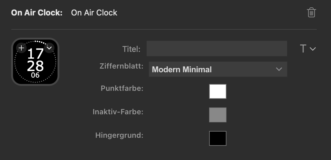
In the property Inspector, I’ve just built a select element to choose between those options. That also makes it easy to build some more, if there’s any other new Ideas. On the code side, there are now just different functions to draw different elements, like the dot ring, the scale, the date, the seconds and more. I just use a switch case to choose what to draw.
Also, I decided to use the system color picker for picking the watch face colors, so that users not understanding HEX colors can also easily create their own color schemes.

Property Inspector is now more user-friendly. Also supports localisation (English and German).
The only thing I’ve got to do now is get the manifest.json done right, create some graphics for ‘advertising’ it and maybe a good icon. Then submit it and hope to get accepted by Elgato and listed in the plugin store (for free, of course).
