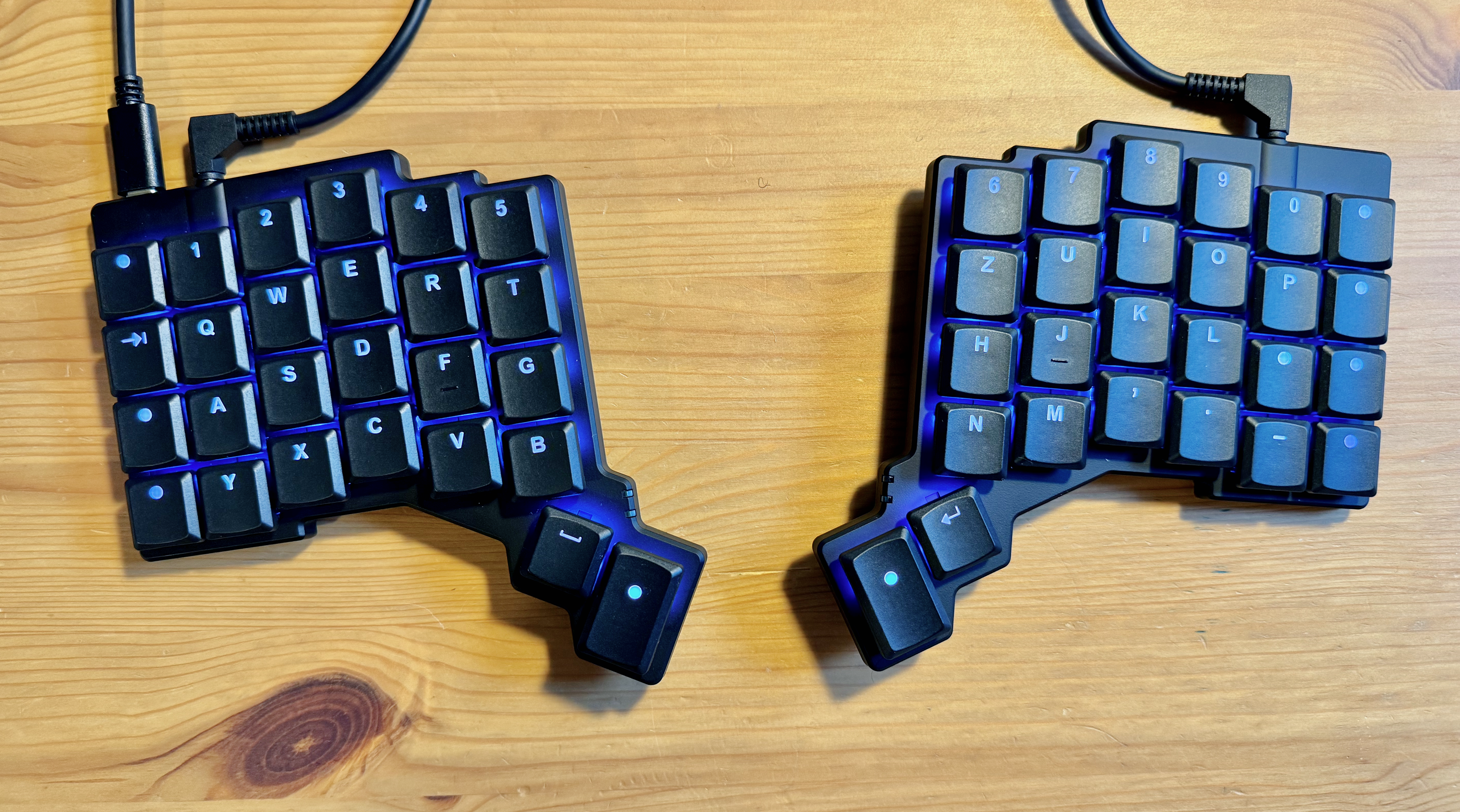
Ergonomic Keyboards
I’m not gonna lie to you, but in my opinion, keyboards suck. Period. It feels like keyboards were invented a century (or even more) ago in the times of typewriters and just adapted when those first mainframe cmputers came up. And since then, nothing ever changed. That’s strange, isn’t it? Especially when considering the overall speed technology evolves.
The main problem is, that the keyboard layouts we’re using simply weren’t designed with the best ergonomics possible in mind, but with the constraints of mechanical typewriters. And yes, I’m that old, I’ve had the pleasure of taking a typewriting course on an actual typewriter with words per minute measured to pass it. (I was not the fastest kid, but not bad at all.)
The thing with the layout
Most people in the world use some variation of the english keyboard layout called QWERTY. As I’m a german native speaker, I’m used to QWERTZ and a strange arrangement of special keys, which makes coding no fun at all.
There are alternative keyboard layouts out there, like Dvorak or Colemak, which promise to be more efficient when it comes to finger movement and commonly used letters. But In the moment, I’m not bold enough for trying such a radical approach of changjing everything.
The thing with the arrangement of the actual keys
Instead, I went for another optimization rabbit hole: ergonomic keyboards.
The keyboards we use day by day are - who would’ve known - derived from the original typewriter layouts. They had that strange row offset so the hammers could all reach the paper with no interference. The problem with that offset is pretty simple: it doesn’t match the nature of our hands. There were some tries by a maker commuity to fix that and make keynboards more ergonomic by arranging keys in a simple grid layout This is also called ortholinear keyboard layout. there were some tries to build a mass compatible product, like the various versions of a mechanical keyboard called Planck. Also, there was some product called niu 40% (40% because it just had 40% of the size of an original keyboard), but they were never really adapted by the masses. Nevertheless, they look fancy and I’d love to get my hands on one, someday.
Another thing worth considering is the arrangement in one flat surface. The natural position of our hands is not made for that, that’s also the reason why those vertical mouses exist. So the next step of the keyboard evolution was going split and angled. And by using layers, also reducing the overall number of keys, reducing the required travel of each finger. These optimizations could reduce tension in hands and arms and make working with a computer faster.
There are some tinkerers out there building such things theirself, using an open source firmware called QMK or other ones. But geting the PCBs, mechanical switches, housings, soldering everything together and hoping that it works - I’m not a fan. So I didn’t dive too deep into that rabbithole.
Until I felt more and more tension in my forearms, also causing some pain after a long day in the office. i was force t think a bit More about ergonmics than I used to. By accident, I discovered this youtube video. So there exists a company offering prebuilt split mechanic keyboards with customizable layouts and firmware? Count me in! And I can even create custom keys, firing shortcuts directly! Whoa!
Getting used to it

The voyager arrived yesterday and in fact, this is the first long text I’m typing on it. Let’s say there’s a steep learning curve. Never did writing a blog post take me that long. Partially because I’m still struggling with the columnar split layout, partially because I’m still finding ways to improve my very basic layout and I constantly recompile the firmware and flash it into the keyboard. (Which works like a charm using their online configuration software)
Things I’ve learned so far
- Setting it up to work with my german mac and layout is a bit tricky - you have to select that it is an ISO keyboard and select the ‘German - Standard’ layout.
- Auto Shift is a game changer!
- Performing my own shortcuts, mapped to keys firing when double tapped of held is just amazing.
- Building the layout that matches my workflow and ergonomics takes a lot of time.
- Color coding special keys and layers is nice, but your eyes should be more on the screen.
If you’re interested, you can also follow the progress of my layout on the ZSA configuration website.
I’ll post an update after using it for a while as my daily driver as there are many things I haven’t tried yet, like writing more german texts, coding and also designing stuff using Adobe software. Also I want to try working with it on my iPad as it also features USB-C.
